
더 센스 오브 데이터 – 김영희 2018, 플랫폼엘 컨템포러리아트센터
What can data reveal about us and societies?
During the preparation of this art exhibition, I lost my beloved father in Seoul. At the moment, I almost gave up having this exhibition but, miraculously, the timing of installation and equipment rentals have worked out well with the kind helps of many – especially Sam An and Kazan Kang from datacook. Kazan’s technical support for data algorithm has been critical for my artwork. Also many thanks to my QUT supervisors: Dr. Jen Seevinck, Dr. Alice Payne and Dr. Jaz Choi. In the end, I was able to hold this solo art exhibition at the Platform-L Contemporary Art Center from 7th of Nov to 17th of Nov 2018 as a part of Platform-L Live Arts Program 2018. Perhaps dad was looking after me after all…
Art Exhibition by Younghui Kim: The Sense of Data – Seoul 2018
Here is the quickly printed postcard with the artwork, ‘Out-Layers – Seoul 2018‘ – screen version. I had to rush out to the printer during the exhibition as I had a very limited time to prepare. Fortunately, the art exhibition has gotten strong feedbacks in the sense of sharing my artistic view of data from the Seoul audience.

The Sense of Data series is the third data art series following the series of [Weight of Data 2016-8] and [mood.cloud-Data as Art 2014].
This series is composed of 3 artworks; two of them are in a set of a wearable and a screen projection piece of live data associated with Seoul.
김영희의 데이터아트 개인전, 더 센스 오브 데이터는 2014년 무드클라우드: 예술로써의 데이터, 2016년 웨이트 오브 데이터를 이은 세번째 데이터아트 시리즈이다. 본 시리즈는 서울과 관련된 데이터로 창작된 3세트의 작품을 전시하고 있다.
Out-Layers – Seoul 2018
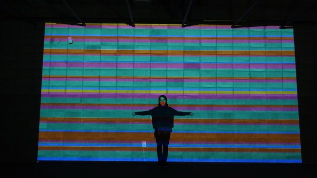
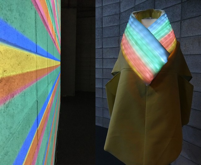
In the first set, ‘Out-Layers – Seoul 2018‘, the artist visualizes the live data of selfie-related texts in the public post of Selfie using the hashtag #셀카 in Instagram – ‘셀카’ means ‘Selfie’ in Korean. The algorithm set in the datacook site looks for the different themes of the captions categorized based on thematic analysis; then visualizes into five colors of stripes: daily – green, travel – blue, emotions – yellow, appearance – pink, and promotion – orange. These bold graphic pattern projected in a large scale on the wall are built and updated with the live data along in parallel with the colourful lights embedded in the wearable version. Both patterns are inspired by Korean traditional color pattern called, ‘Sakdong’ and Hanbok image collars called, ‘Dong Jeong‘.
첫번째 작품, ‘아웃레이어스-서울 2018’ (버전 1) 는 셀피관련된 한글 캡션데이터를 데이터쿡 사이트에서 라이브로 프로세스되는 알고리즘에 의해 글의 내용을 다섯가지로 분류하고 다섯가지의 색으로 표현한 작품이다. 실시간 데이터는 일상-초록, 여행-파랑, 감정-노랑, 외모-핑크, 광고-주황 으로 긴 띠를 이루어 차곡차곡 대형스크린에 쌓여져 간다. 새로운 세트의 다섯색의 띠가 데이터에 의해 업데이트될 때마다 웨어러블의 스카프 부분의 LED색도 함께 맞추어 패턴이 변한다. 웨어러블의 스카프부분은 한복의 동정에서 영감을 얻어 제작되었으며, 색의 띠도 ‘색동’ 띠에서 영감을 얻었다. 본 작품은 새로운 데이터와 알고리즘으로 더 발전시킬 계획이다.
Please go to the project link here for more info and photos about this work >>>
BreatheOut – Seoul 2018
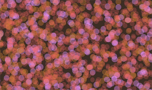
The set of artworks, ‘BreatheOut – Seoul 2018′ visualizes the live data of the air quality of Seoul – specifically the micro dust pollution levels in the district of the gallery is sited.
BreatheOut – Seoul 2018′은 첫번째 버전으로 웨어러블과 대형 스크린이 세트로 형성되어 있다. 이 작품은 전시장이 위치한 서울시 강남구의 실시간 공기데이터를 가공하여 라이브데이터 드리븐 아트 작품이다.

The air we breathe out unconsciously gets mixed up with the surrounding air, and we share this circling air by breathing in and out. ‘BreatheOut – Seoul 2018‘ visualizes the interaction of our breathing out, blending with the live visualization of the current air dust quality.
The artist visualized the air particles into small circles in different sizes, opacity, and colors then refers them as, ‘air bubbles’. These movements of air bubbles are intentionally designed to be airy and in depth, at the same time, computationally randomized. This creates a meditative environment where one can stare at it for a while. The live data was filtered through an algorithm in the artwork and visualized into tiny moving air bubbles in different color stages based on the AQI (Air Quality Index) Calculator provided by airnow.gov. Each layer of the air bubbles is displayed in one of three colors depending on the real-time data provided by the Seoul City Open Data API: green being healthy, orange being sensitive and light pink being unhealthy for some people.
The wearable also displays the color status of micro dust in LEDs embedded in the live data visualization, therefore data-driven.

Please go to the project link here for more info and photos>>>>>
Seeking for Outliers – Seoul 2018
As a part of her PhD research, “Artistic Exploration of Data Through Creative Practice“, Younghui begins to explore the meaning of outliers in data through her art practice and aims to expand the use of real-time data as art material for conceptual art practice through this series. It has been a long process of exploring data through an artistic approach for her already. Therefore, this artwork is the process, not a completion of work. In Seeking for Outliers, the artist first gathered her words that she posted on the walls of Facebook for ten years of her stay in Seoul – from Feb 2007 to Jan 2017. Apparently, the dataset was large which easily crashed the data analytic tools she played with.
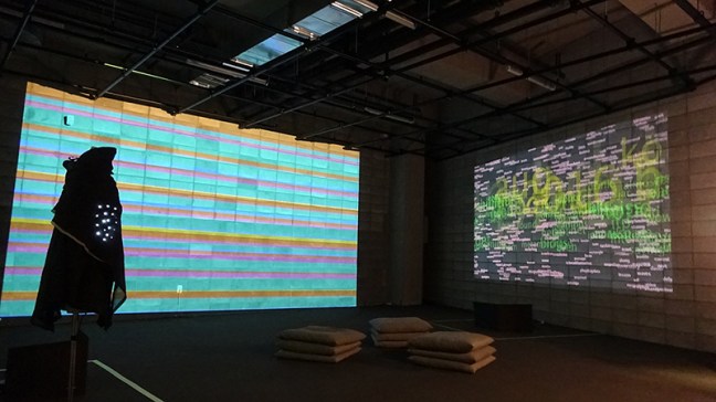
To trace her memories of thoughts, opinions, and actions for the ten years living in Seoul, she first gathered English words as she often posts on the wall in two languages. Then she displayed the words by the counts of the word usage into her artwork to seek for the words that reveal her thoughts based on her memory and experience.
Throught ‘Seeking for Outliers‘, Younghui tries to understand the outliers of her past with her own memories and experience and based on its revelation, she expects to continue to further practice with this concept of outliers in the close future. The video below is a clip where the artist reads word by word out loud during the exhibition.


